
Typography | Brand Identity
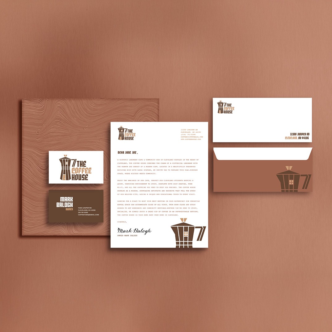
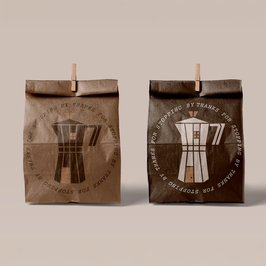
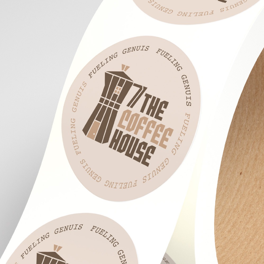
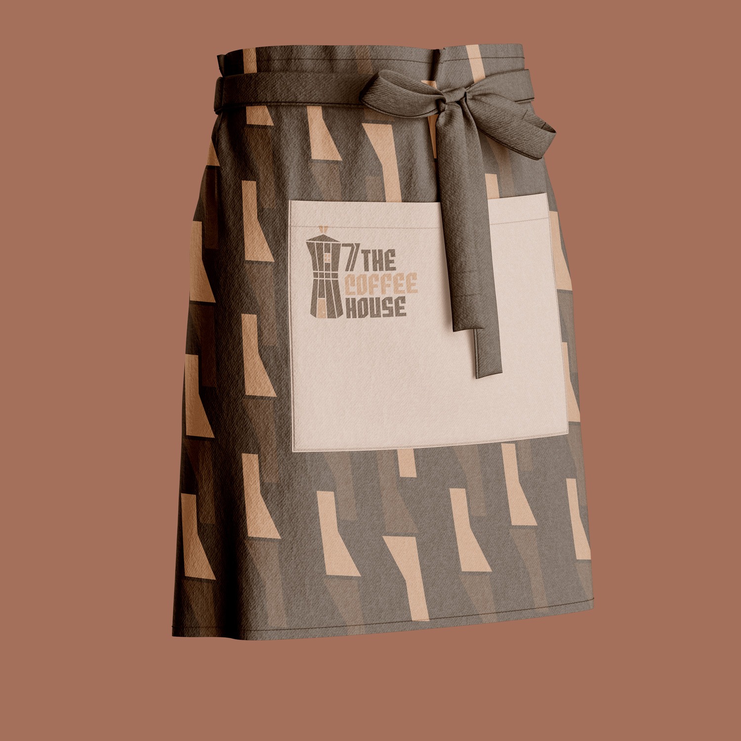
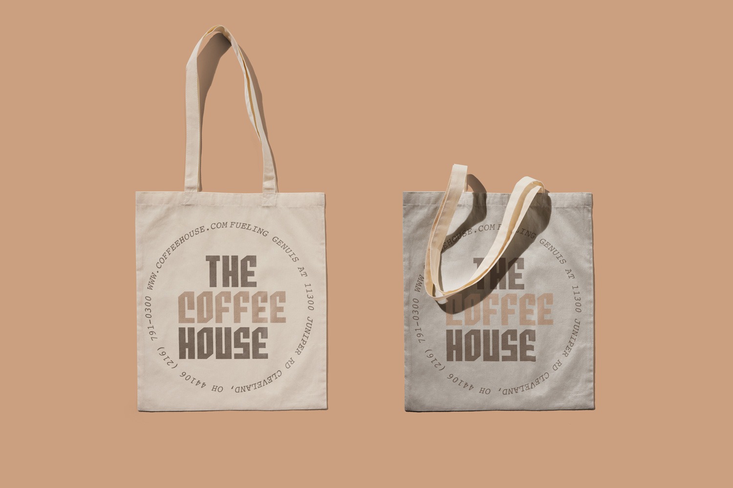
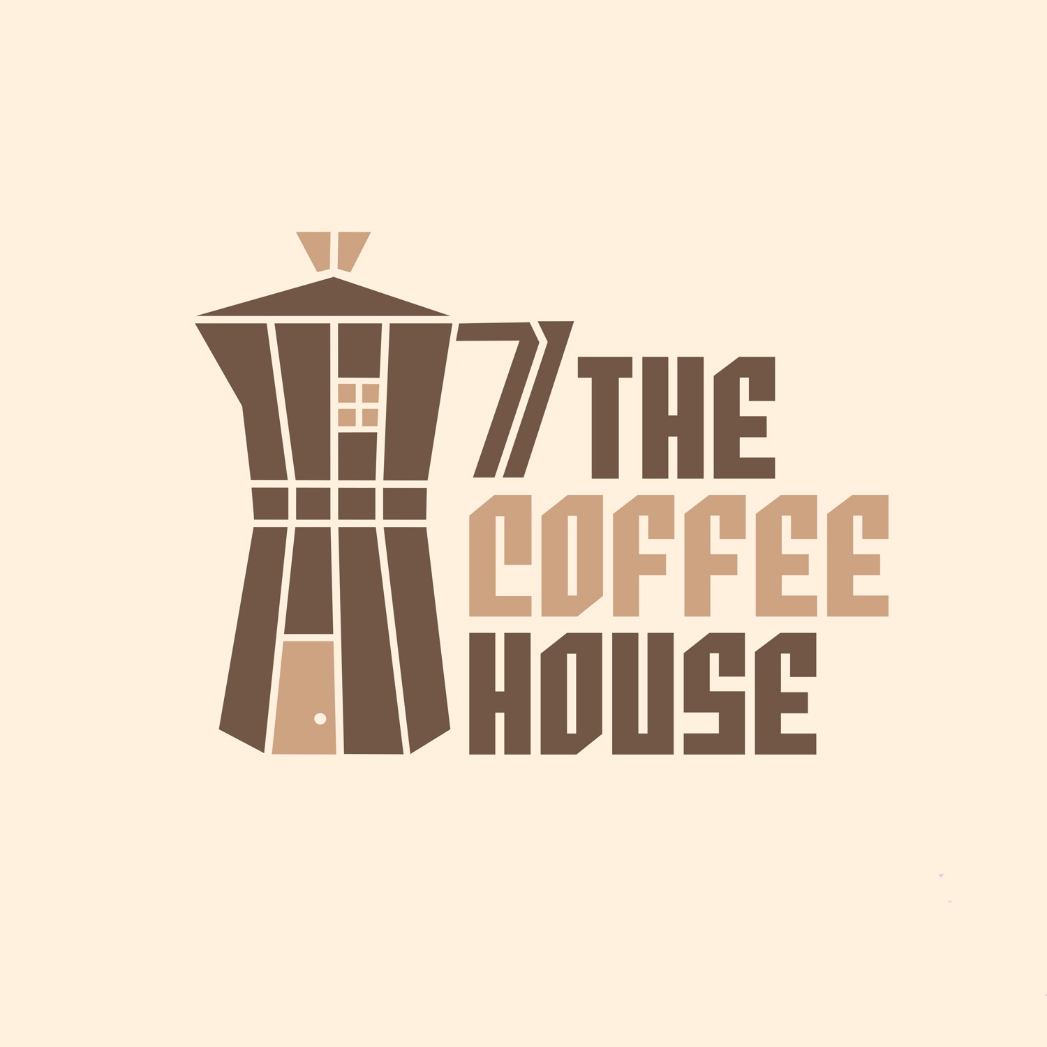
This project is a typography, brand identity, and marketing design project. It was designed as a rebrand for The Coffee House. The problem was that the existing brand felt outdated, had unclear visual hierarchy, and the green circle element did not support the overall identity. The main focus of the brand should be the coffee and the experience surrounding it.
My role as a graphic designer was to rethink how the brand could be updated for the future while still keeping the unique charm that made it recognizable. I focused on revamping the brand identity, improving the visual hierarchy, and making coffee the main focus across different marketing materials.
The value I brought to this project was my ability to analyze
an existing brand and identify areas where the design could
be improved. I focused on typography, layout, and brand
elements to create a stronger identity that felt more intentional and connected.
My impact on this project was creating a refreshed identity that modernized the brand without removing its original character. By making coffee more prominent and improving the overall visual system, I created a design direction that could better connect with customers and support future brand growth.